Jurors: Igor Babailov, MFA and Marcus Burke, PhD
FIRST PRIZE:
Diane Aeschliman for Papillon
SECOND PRIZE:
Joyce Zeller for Benji
THIRD PRIZE:
Debbie Hennes for Alex & Tory
PEOPLE's CHOICE AWARD:
Howard Aaron for Howard
HONORABLE MENTIONS:
Michel Delafontaine for The Prince
Nanci France for Portrait of Liam
Jeanine Jackson for John Anderson
Sophia James for Michael
Liz Jorg Masi for Rose
Alain Picard for Natalia
William Rorick for Tom
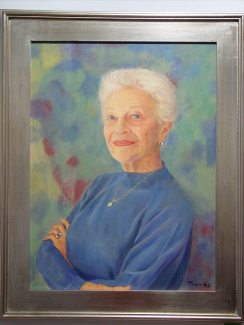
Encarna Thomas for Barbara
Michele Tycz for C.A.M.I.
Sandra Wakeen for Katherine
Jurors’ Statement
Igor V. Babailov and Marcus B. Burke
In judging this excellent group of portraits, we looked at each work from the point of view of several artistic categories. Among these were: Composition (in a very wide sense of the word), Lifelike Qualities, Anatomy and Drawing, the use of Photography, and a sense of the Relationship of Parts to the Whole.
Composition (or Design). Under Composition, we looked for a wide range of qualities. How did the composition “sit” on the canvas? How was it received by the viewer? Was the composition original, arresting, interesting, and well focused? What was the pattern of lights versus darks? What was the range of tonal values? Were the lights and darks and the whole range of tonal values successfully deployed? Was color successfully integrated into the composition in both abstract and illusionistic terms?
Was there harmony within the image or composition? Was the composition successfully balanced and complete? -- That is, had the composition arrived at the point where you would not want to add anything or take anything away?
We looked for consistency of technique, format, and artistic vision. If a painting started doing something in one corner, did it continue to follow the same artistic vision or design terms overall?
Lifelikeness. We asked, did the image appear convincing and life-like? We applied this both to realistic and more abstract compositions. We wanted a psychological presence, a sense of personality. We also looked for evidence of the artist’s engagement with the sitter or the composition.
Anatomy and Drawing. Both of us were extremely rigorous about anatomy and drawing, including perspective, proportions, and foreshortening. (These were qualities related to lifelikeness as well.) We were especially concerned about the proportions of the face and the correct anatomy and scale of the face and head. We noticed that nearly every artist had difficulties with hands, both in terms of the actual drawing of a hand and even more with issues of proportion and relation to the body. Often one hand was more or less finished than the other without this variation being an obvious compositional element. Here an absence of life drawing was noticeable at several points. Hands have been called “a second portrait,” as the paintings of Van Dyck so admirably illustrate. We also noticed several artists having difficulties with the muscles and tendons of the neck. On the other hand, we admired the command of facial anatomy (including cheekbones and structure) expressed in many of the likenesses.
Photography. We did not like to see photography used as a crutch (bad), as opposed to photography being used as a tool (an often necessary part of modern art making). Did the flattening, abstracting, and contrast-increasing aspects of photography interfere with the lifelike quality of the image? Were these aspects either used as artistic values in their own right or corrected by studying the subject from life? Was the artist able to “get around the edges” in the drawing aspects of the work, or did photography (or the metaphor of photography) compromise the drawing?
Relationships. We wanted to see the artist controlling the relation of parts to the whole, of details to the larger form. We wanted a sense of Unity or Harmony. We applied these criteria to the rendering of faces, to the presentation of the human body, and in fact, to the whole composition. Some artists got into trouble on this score, with details being at war with the overall conception of the piece.
Priorities. We were interested in seeing what the artist gave priority to – what was the most important thing in the image? And, once decided upon, did the artist consistently follow this priority? Like a musical composition, a work of visual art needs a theme, a priority, and a focal point. Did this focus connect to a sense of Unity or Harmony in the composition, or were the focus and the composition at odds?
...In general, we were very favorably impressed.


